


For almost three years, I managed UX on REVEL, Pearson’s flagship courseware platform. My tenure saw a 28% quarter over quarter increase in institutional adoptions of REVEL, along with a 75% decrease in customer service call volume.
When I inherited REVEL, it had a user base in the low tens of thousands, and it needed to evolve quickly to serve a user base in the millions. Design decisions that had made more sense when REVEL was first developed had to be reevaluated in the context of a released product with many stakeholders.
When I took over UX on REVEL, an immediate concern was users having difficulty assigning readings and homework. The majority of customer service contacts regarding the product at the time had to do with assignments.
I started by initiating research into where the assignment management experience was failing users. Our study showed that users were confused about when materials had been assigned or not, so we redesigned key interactions to clarify for users whether actions they’d taken had been successful.
The result was a dramatic increase in task completion (from about 25% to 75% for first time users) , accompanied by a corresponding drop in customer service calls.
Pearson lacked a unified design framework or design language at the time that REVEL was designed. Even within the app, multiple UI elements had in some places been used for the same functionality.
In concert with other UX managers, I began inventorying usage of UI elements. This would allow us all to converge on meanings of UI elements as we hammered out a common design language. And in the process, I’d be weeding out duplicate icon usage in my own product. Ultimately, this fed into a design framework effort that spanned many products and largely eliminated ambiguities about how designers should use affordances.
During work on an editor for multiple choice questions, I identified some low-effort ways to add value to the feature. One idea was to show the user contextual hints on how to write better questions.
Pearson had an overarching strategic goal of showing that its products were more effective than free alternatives. The company had both a Learning Science group and a Learning Design department, so I moved to tap their expertise. In collaboration with an engineer, we designed a question editor that analyzed the user’s input and provided advice on the content based on principles of learning design.
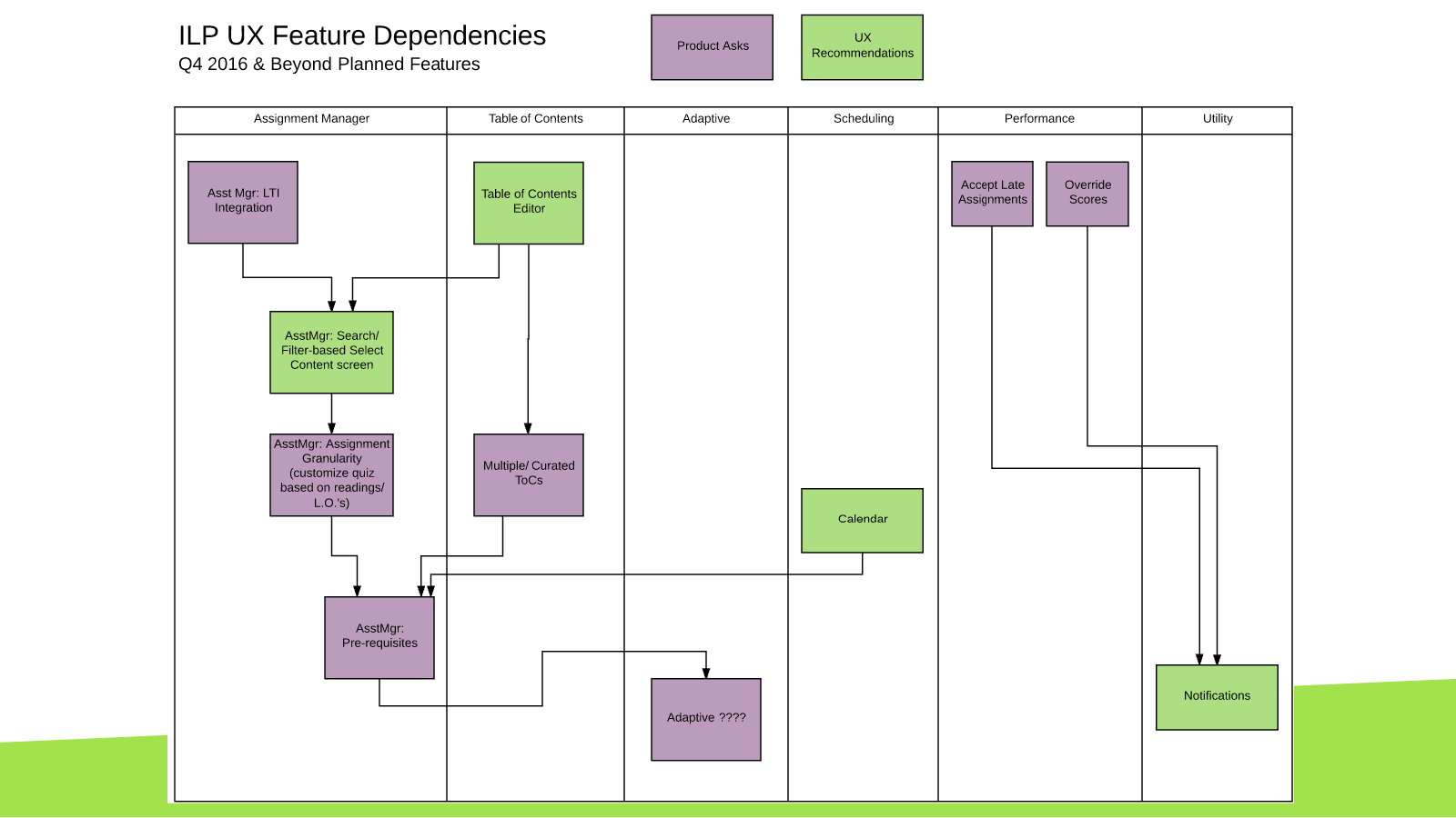
I aided feature planning during each cycle of iterations by helping product managers visualize the dependencies between UX projects.
Despite the large size of the company, REVEL’s high profile in Pearson’s product portfolio meant that interest in what my team was designing regularly went up to the C-suite. This design helped executives understand how ILP (an internal name for REVEL) had evolved from three earlier projects to offer a suite of features.
Regular user testing and iteration were constants during my years on the product. One area where we made a lot of small moves was the gradebook. Beyond user testing, we had a great feedback loop with educators who used the product every day, and we drew on this feedback continuously.
One interesting challenge was designing a gradebook that accommodated instructors across many disciplines. When it comes to visualizing student performance, instructors in STEM disciplines have different needs from humanities instructors. We accommodated these needs partly through settings that let instructors customize their gradebook views, and partly through selectively exposing functionality based on content.