


Percipio, Skillsoft’s flagship corporate training platform, needed a way to keep users engaged so that they regularly access learning content.
Our app was struggling against a pattern of usage dominated by task-oriented users who only access the platform when notified by email that they’ve been assigned training. Learners who take advantage of the platform and pursue learning on their own didn’t drive as much traffic.
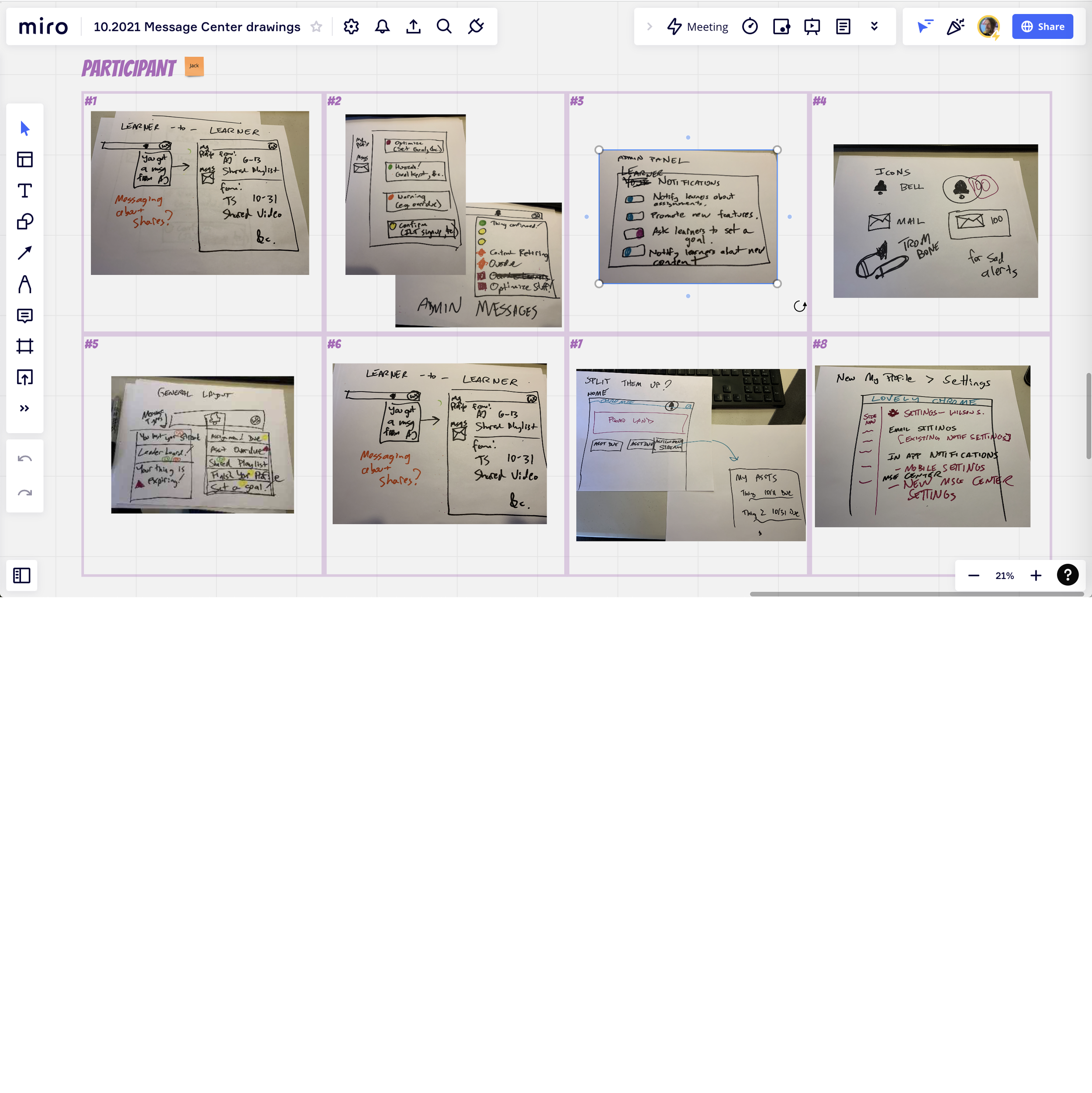
Based on the observation that many apps leverage their notification feed features to drive engagement, we started planning our own.
I love it when a workshop is fun for the participants, and it generates a lot of high quality, actionable ideas. That’s why this currently stands as my favorite UX workshop I’ve ever run. Everyone was into it, we got great ideas, and we all left in a good mood with a shared vision.
Miro was the tool of the day, and it worked very well in the virtual workshop format.
Workshopping was just one element of this discovery process. We reviewed past UXR and customer requests to identify needs that a notification feed might serve.
Both UX and product managers conducted extensive competitive research. We organized regular show & tells where team members shared and debated our individual discoveries. We considered our direct competitors, the larger EdTech industry, and major social networks (since they’ve shaped many best practices).
“Wait, doesn’t Definition come first?”
Normally, but Skillsoft’s quarterly innovation event provided a surprise opportunity to try out some ideas in a less formal way with an eager team of developers.
I rapidly sketched out an approach based on our early Discovery conversations, which were still ongoing at that point.
Each type of notification has an icon in low-key gray (except for late notices, which are red), a message, and some additional text that might be either meta info or a call to action. Tapping a notification takes you to the relevant screen; swiping deletes it.
While my developer colleagues used the initial quick and dirty designs to build a proof of concept, product and UX worked on defining the feature set more tightly before iterating the design. We defined the MVP set of notification types, refined the visuals, and worked with our writer to improve the text.
Finally, after a review by our Accessibility colleagues, I added a blue dot (with alt text) that indicates read or unread status of a message. This gets around the issue of the blue and white background colors not contrasting sufficiently to meet A11Y standards.
Two prototypes were created for this project. I created a pixel perfect prototype for use in customer interviews and presentations to internal stakeholders. The innovation dev team I worked with stood up a functional prototype. The latter helped answer technical questions and promote the feature internally, while the former has been invaluable in demonstrating interactions to the devs who need to code them.
As of this writing, I’m still eagerly awaiting the first month’s analytics on this feature. Several new types of notifications are already planned post-MVP, and adding the feature to the web browser version of the app is also on the docket.